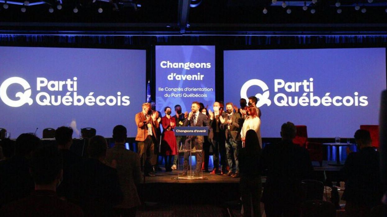
The PQ's New Logo Is Nearly Identical To A Kazakhstani Company's & Twitter Noticed
Coincidence, homage or something else?
This is definitely not why the Parti Québécois wanted to be in the news after unveiling its new logo, but even it can't escape the power of a good graphic designer armed with social media.
After the PQ presented its new brand image at a caucus meeting in Trois-Rivères on December 4, a few eagle-eyed observers noticed that the party's new logo looks suspiciously like that of another business. In Kazakhstan.
The resemblance has certainly raised some eyebrows.
One graphic artist on Twitter showed how the petals of the fleur-de-lys design have just a slightly different orientation in the two logos. Despite that subtle difference, the graphic artist, Vincent Beaudry, opined that "the details are too identical for it to be a coincidence."
The Kazakhstani company, QazContract, calls itself the country's "largest consulting service" on its Facebook page. Its logo, featuring a stylized letter "Q," seems to look like a perfect logo for an upstart québécois political party with its fleur-de-lys-like flair.
In a tweet, the PQ said, "Our new visual identity speaks as much to our rich heritage as to the momentum we want to give to the Quebec of today and tomorrow." Previous iterations of the party logo featured a "Q" — of course — with a sharp, triangle-shaped tail.
In a statement shared with the Journal Métro, the PQ insisted that it didn't copy the logo and claimed that it's an original design.
So we ask you, graphic designers of the internet — is this the same logo?

