The 8 "ugliest" metro stations in Montreal, according to STM riders
Are the tiles at LG really that bad???
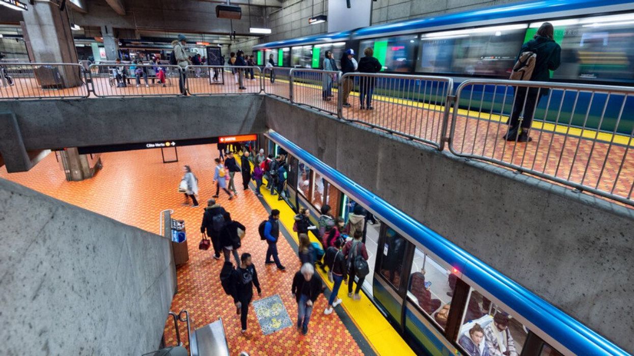
Here are the stations Montrealers love to hate most, and what they had to say about them.
Many Montreal metro stations are admired for their unique art, colour patterns, and architecture. But not every Société de transport de Montréal (STM) entry point is a masterpiece. Some are drab, dark, or downright depressing, at least according to MTL Blog readers.
So when we asked our Facebook followers which Montreal metro station they think is the "ugliest", hundreds of answers came pouring in. From cold concrete designs to stations that feel stuck in the 1970s, people didn't hold back.
Here are the stations Montrealers love to hate most, and what they had to say about them.
Frontenac
Frontenac was among the most commonly named stations in the thread. Many readers described it as old, gloomy, and in need of serious repairs.
One person summed up a list of issues, writing that for "more than 25 years it has been crumbling to pieces. The water damage there is staggering; it flows behind a double wall. You literally hear the water running from behind certain walls. Not dripping, pouring. The once-white, rounded ceiling is also full of black mold. Very unhealthy."
Another described it as "ugly" with "old, grey and brown tiles."
"It looks like they took the last items left on the shelf at a discount store. No artwork anywhere."
Someone else noted that nearby Préfontaine, the next stop on the green line, feels like the complete opposite with its bright, open design.
Lionel-Groulx
As one of Montreal's busiest transfer points, Lionel-Groulx caught a lot of criticism for its appearance.
"From outside it's terrible looking," one commenter said. "It gets better once we go down the stairs, but for a major hub where the two busiest lines meet, it deserves a much better entrance and exit."
While many Instagrammers would disagree, another user argued that Lionel-Groulx's multicoloured floor tile pattern is too "loud."
De l'Église
De l'Église was another repeat offender. One reader said, "The station lacks the visual flair or architectural detail that more celebrated stations have. It shows wear. Water stains, grime, maybe less frequent refreshing. The space feels narrow and confining, not much open volume or grand hallways."
Others noted that the Verdun stop simply looks tired and hasn't been updated in years.
Guy-Concordia
Along with complaints about heat levels and cleanliness, Guy-Concordia's bold colour scheme didn't win anyone over. "The red, orange, yellow, grey, black colour design is headache-inducing," one person said.
Several commenters also mentioned how crowded and confusing the tunnels can be, especially during rush hour.
Laurier
Laurier also made the list for its aging infrastructure and constant repairs. One person wrote in French, "The surface of the tunnel looks like it's collapsing. The work never ends. There's water infiltration everywhere."
Many agreed that the Orange Line station feels neglected and stuck in a permanent state of construction.
Beaubien
Beaubien was described as plain and uninspired. "It's dead concrete, nothing artistic or colourful about it," one reader said. "The lower ceiling makes it even worse, giving a sense of claustrophobia."
Sauvé
Sauvé's brown and beige tiles got their share of complaints too. One French-speaking commenter wrote, "Brown and beige tiles, square corridors, claustrophobic. We call it the giant crossword."
The station was also called dull and outdated, with several insinuating that it feels more like a bunker than a metro stop.
Saint-Laurent
Saint-Laurent also appeared several times in the comments. "Definitely Saint-Laurent. No distinctive architecture at all," one person said.
Despite its central location in the Quartier des Spectacles, readers said the station's design is bland and forgettable.
- A TikToker tried to diss the STM's Blue Line and Montrealers are letting him have it ›
- A Montreal TikToker is going viral for peeing on landmarks across the city ›
- Montreal's STM is going on strike AGAIN — and this one could last nearly a month ›
- Montreal's STM strike: Here are the full metro & bus schedules for November ›
- STM shutdown: Montreal will have ZERO public transportation options for one day this weekend - MTL Blog ›
- Montreal is officially one of the world's "friendliest" cities but two US spots beat it - MTL Blog ›
- Canadiens players held a Halloween party and it included some hilarious costumes - MTL Blog ›
- 11 crucial tips for surviving a Montreal winter, according to people who live here - MTL Blog ›
- The 9 "prettiest" Montreal metro stations, according to STM users - MTL Blog ›